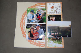
I made these two layout this week using the Felicity Collection. Just loving this set of paper, die-cuts and stamps! Can't get enough of it. As always, click on the images to view them bigger and better.

For this top page I had two extra pictures I really wanted in the layout, but didn't want to do a whole other page for them. So I used a product called
Flip-Flaps from Close To My Heart. This was my first time working with them, and I look forward to playing around with it more in the future. I really like the concept of it.


The empty space below the one on the left is waiting for a picture I need to get from Kenny's Mom. It's a picture of Kenny as a kid lined up like the above picture with all his cousins. I thought it would be nice to have two generations of cousins side by side.
 For this top page I had two extra pictures I really wanted in the layout, but didn't want to do a whole other page for them. So I used a product called Flip-Flaps from Close To My Heart. This was my first time working with them, and I look forward to playing around with it more in the future. I really like the concept of it.
 The empty space below the one on the left is waiting for a picture I need to get from Kenny's Mom. It's a picture of Kenny as a kid lined up like the above picture with all his cousins. I thought it would be nice to have two generations of cousins side by side.

Love the new pages! I have yet to break out my Felicity pack and play with it. I really need to get a move on!
ReplyDelete